Some of us have been able to ride out these complicated times at home, without too much difficulty, but many other people have had a really hard time.
Food banks are seeing growing demand, and feeding hungry people takes money.
Anything that can do to make the most of their appeals for donations makes a difference.
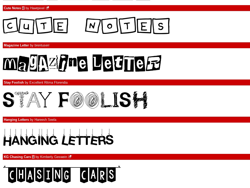
Amazingly, one thing they can do is pay closer attention to typefaces.
That’s the conclusion of a new study from Ohio State University.
The researchers told subjects to imagine they were picking up food from a restaurant, and saw flyers explaining that the restaurant was partnering with a food bank to help those in need during the pandemic.
Then they asked whether they might donate, and if so, how much.
They found that people were more interested in donating when the fonts on the flyers matched the type of message.
Appeals about helping people were most effective with fonts that looked like handwriting, gentler fonts, while flyers that stressed how effective the organization was were best with more official looking fonts.
The researchers say that nonprofits may be missing out on potential donations just based on the typeface alone.
Fortunately, that also might mean that they might be able to feed more hungry people, with a font change or two.
Now it’s time to get out the vote! For this year’s Comedy Wildlife Photography Awards.
There are 44 finalists, but they’re all like giraffes photobombing each other and bears changing truck tires, so it’s worth going through all of them.
Donors more likely to give to COVID causes when font matches message (Ohio State University)
The Affinity Photo People’s Choice Award (Comedy Wildlife Photography Awards)
Thanks to our backers on Patreon for their support of the show!

